
20 20
///
20 19
BRAND GUIDELINES / BRAND IDENTITY / BRAND STRATEGY / LAUNCH STRATEGY
SABA Medicals
In Saudi Arabia
SABA Medicals aims to provide authentic healthcare in KSA. It’s the umbrella for two main sub-brands; SABA Clinics and SABA Pharmacy. Each sub-brand has been color-coded to identify the different missions, values, and services.
SABA Clinics is blue.
SABA Pharmacy is teal blue.
Clinics Logo

Pharmacy Logo

Logo Rationale
The logo’s main shape is based on the “Star of Life”, combined in two intersecting arrows. The two arrows represent the union of two entities, the clinic and the pharmacy.

Star of Life
Two arrows representing:
Clinics + Pharmacy
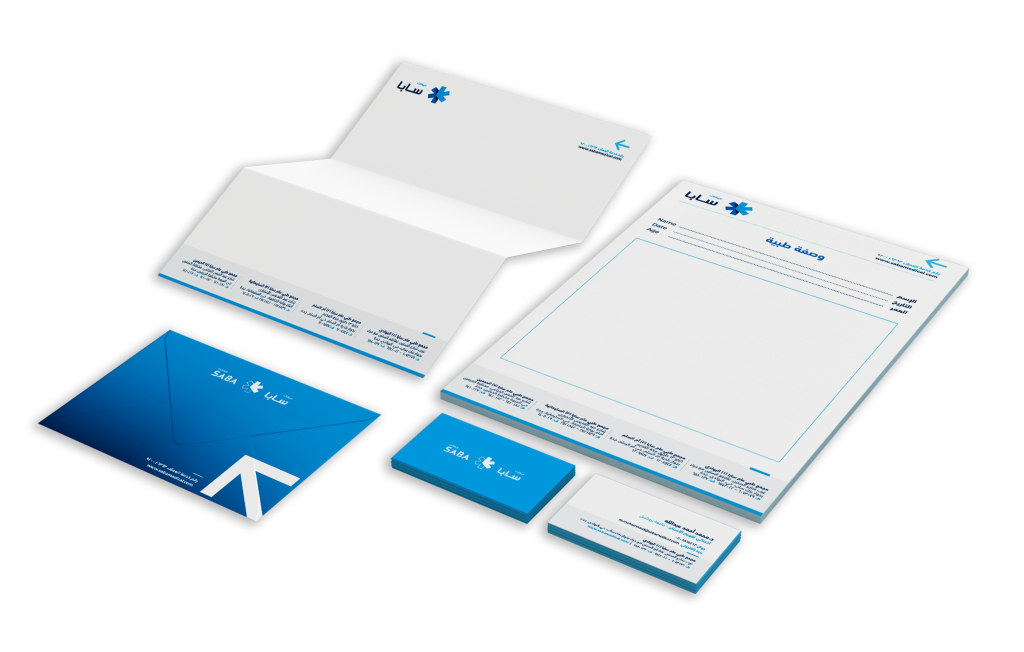
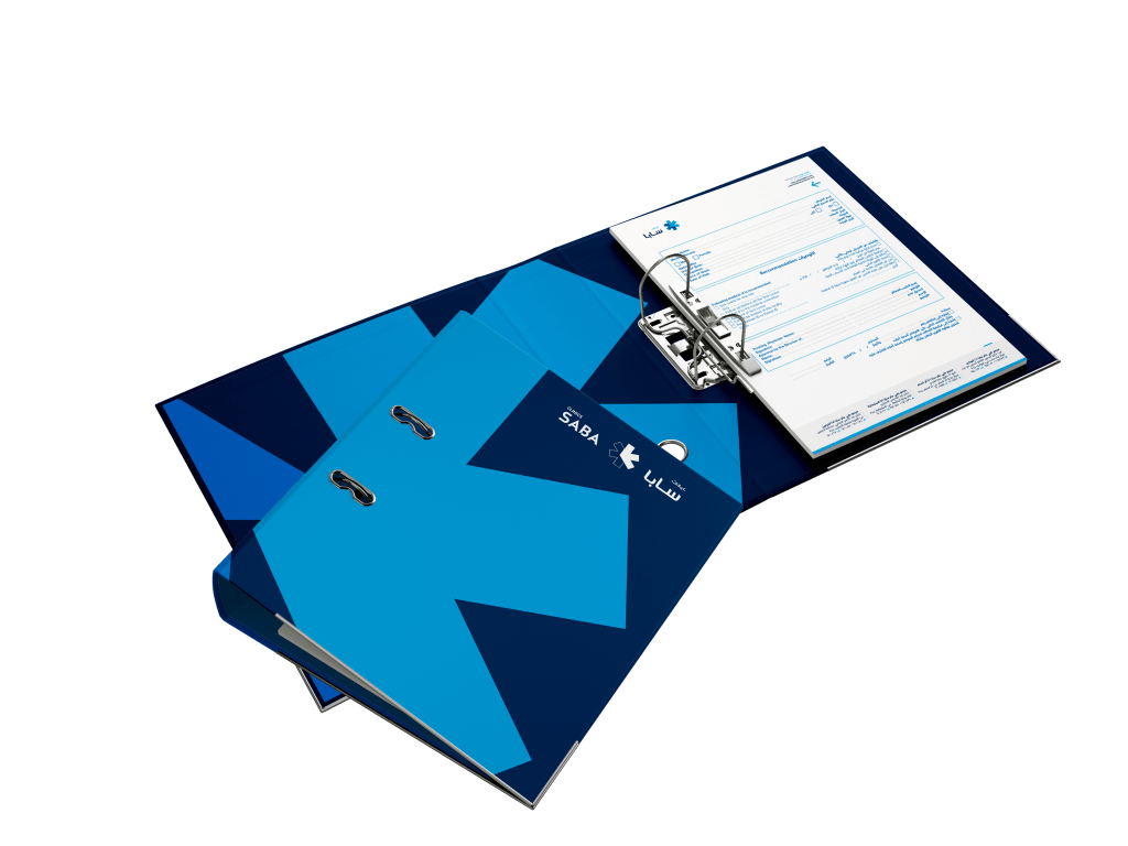
Logo Version

Brand Guidelines / Brand Identity / Brand Strategy / Launch Strategy
Excellent Healthcare Experience
Kingdom of Saudi Arabia
The core brand themes are the foundation stone for our marketing communication and would reflect our visitors center’s main objective.
They will help us in building a consistent voice across all the visitor of SABA Medical clinics and pharmacies.
Our tone of voice defines the way we communicate with our target audiences.
A distinctive and consistent tone of voice helps us tell the world who we are. It builds recognition and brings an understanding of the essence of the visitor center. Confidence, Innovation, Aspiration, Motivation.
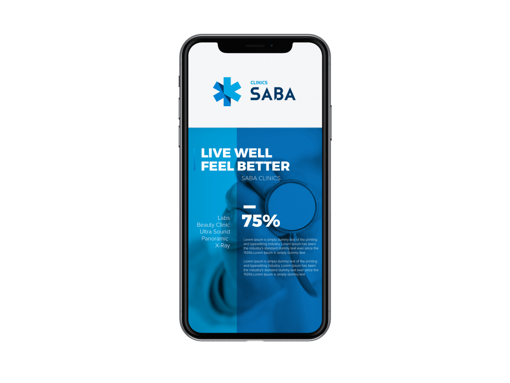

SABA Clinics aims to be a leader in improving the health of our community through family and patient-centered healthcare services. We will be the clinics of choice for patients, employees, providers and the communities we serve.
BRAND GUIDELINES / BRAND IDENTITY / BRAND STRATEGY / LAUNCH STRATEGY
A brand identity
that speaks to
the community
In Kingdom of Saudi Arabia
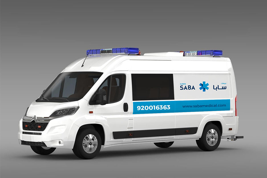
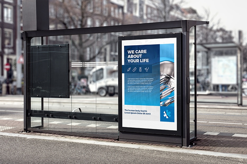

BRAND GUIDELINES / BRAND IDENTITY / BRAND STRATEGY / LAUNCH STRATEGY
Other Medical Field Clients

|
|
|
|

|
|
Check out other case studies..
Contact Us
Lebanon: +961 70 823 965
KSA: +966 542 676 851
info@douzedegres.com
Dbayeh seaside road, Block A Business Area, Siwar center, Dbayeh, Lebanon
Douze Degres. All Rights Reserved 2020 ©